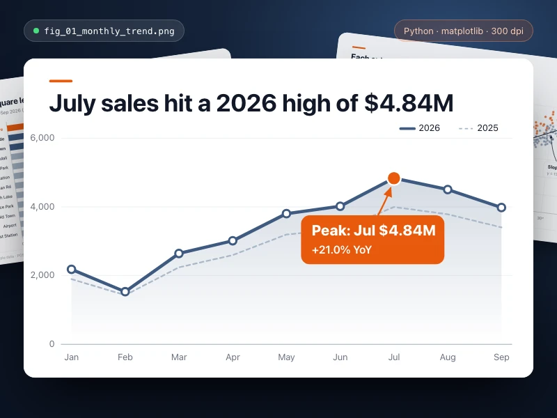
Data chart
Turn data into a publication-quality chart with Python: full titles, axes and legend, key points highlighted, exported as high-res PNG / SVG for your report.
Prompt
Make a line chart of my monthly store sales for our quarterly review: show this year's trend against the same months last year, mark the highest and lowest points, and use a title that states the takeaway. Colors: clean blue-gray with orange for highlights, with axis units and a legend. Export a high-resolution PNG and an SVG.
- Source
- Ofox
How to use
- 1
Tap “Make one like this”
Ofox Chat opens with this request already written. Sign in first if you haven’t.
- 2
Make it yours
Edit the highlighted parts of the prompt to swap in your own details.
- 3
Send and create
Send it and Ofox Chat writes and runs the code, then you can preview or download the result. Keep chatting to change it.
FAQ
What do I get?
A web page you can open right away. Ofox Chat writes the code and runs it in a sandbox; you can preview the result in the chat and download the code files.
Do I need to know how to code?
No. Describe what you want in plain words and upload any files it should work on — Ofox Chat writes and runs the code.
Can I edit the prompt?
Yes. The prompt goes into the Ofox Chat input box — swap in your own topic, add requirements or drop what you don’t need before sending.
Can I copy and use the prompt directly?
Yes. Tap “Copy” on the prompt card to get the plain text — it works in other AI coding tools too.
More like this
More Data prompts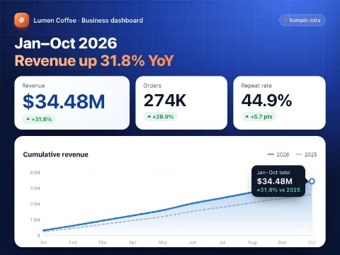 Data dashboardCode · Data
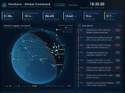 Global command centerCode · Data
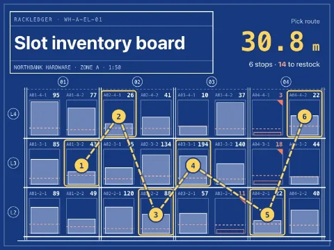 Slot inventory boardCode · Data
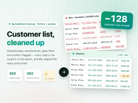 Clean up a spreadsheetCode · Data
 Product landing pageCode · Web pages
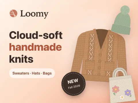 Fashion brand storeCode · Web pages
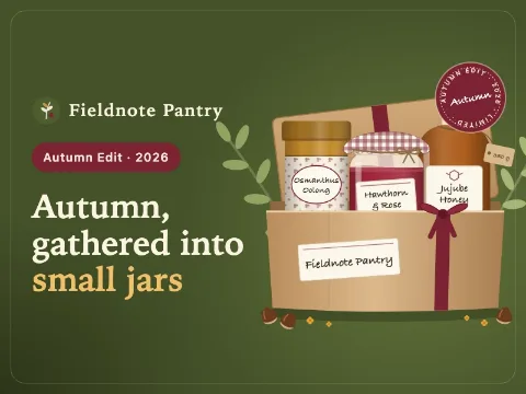 Food gift shopCode · Web pages
 Digital goods marketplaceCode · Web pages
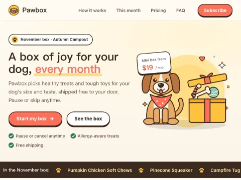 Subscription box siteCode · Web pages
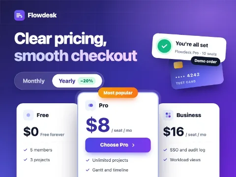 SaaS pricing & checkoutCode · Web pages
Have an idea of your own? Start creating
Describe the image you want in one sentence, and Ofox Chat creates it from scratch.